
Graph your data
The Reporting > Graphs page in SiteHive lets you visualise and analyse data across aspects for any selected date range. This helps you track trends, identify exceedances, and generate visual material for reports easily.
How to graph data
The same steps apply whichever way you slice the data:
Select the aspect from the dropdown (Noise, Dust or Vibration).
Select the date range you want to look at.
Choose Graph By: Parameter, Monitoring Point or Device (see below for when to use each).
Select which parameters, Monitoring Points or devices you would like to graph.
If you have thresholds, choose which thresholds to display on the graph.
Toggle the parameters you want to show. In Parameter mode each parameter gets its own graph; in the other modes coloured lines differentiate the series.
Select which time intervals you would like to view the data in.
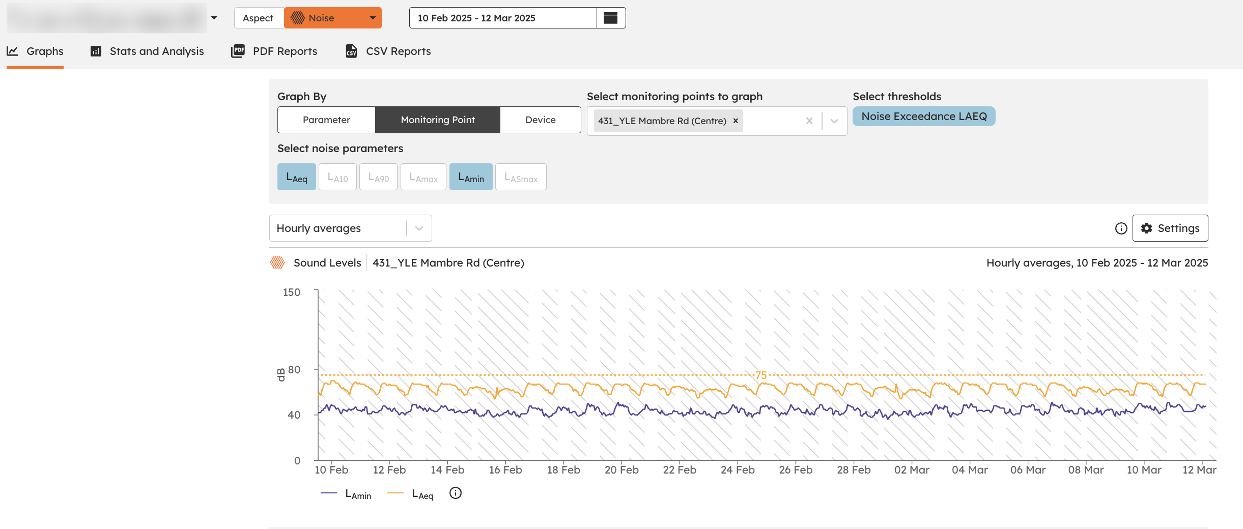
Parameter
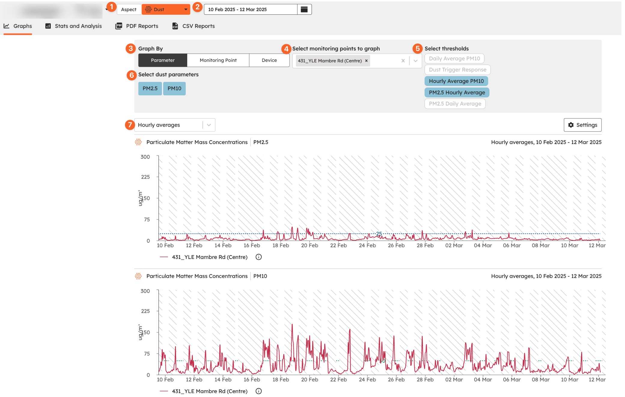
Parameters let you analyse a specific type of data, such as:
Noise (e.g. LAeq, LAmax)
Vibration (e.g. vSum, X Peak, Y Peak and Z Peak)
Dust (e.g. PM10, PM2.5)
When to use: select a parameter to compare trends over time, or to check exceedances and patterns in a specific environmental factor.
Monitoring Point
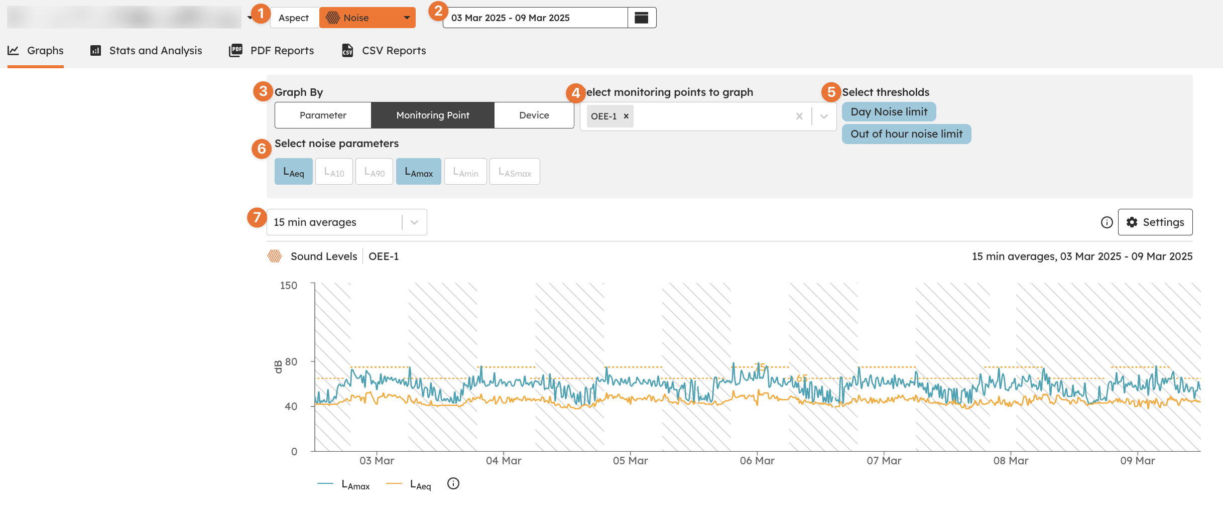
A Monitoring Point represents a specific location where measurements are taken.
When to use: view data from a single Monitoring Point, or compare multiple Monitoring Points to see how different areas are performing.
Device
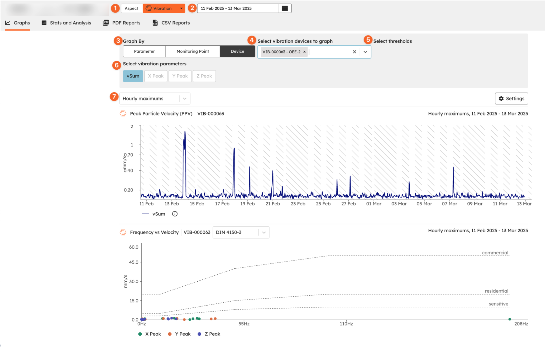
Each Monitoring Point can have one or more devices collecting data. Viewing data at the Device level helps you:
Compare trends across different devices.
Understand how individual devices contribute to overall site data.
Identify opportunities to optimise monitoring coverage.
When to use: select a device to explore its specific readings, or compare devices within a Monitoring Point to track consistency.
Weather
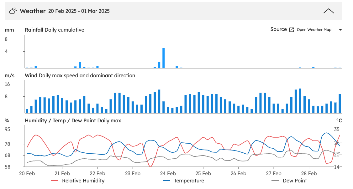
At the bottom of the Graph Data page is the weather for the selected date range. See rainfall, wind, humidity and temperature for each day.
What’s next
Stats and Analysis (high-level stats, daily averages and aggregated tables)
PDF Reports (turn what you found into a shareable site report)
CSV Reports (raw data in spreadsheet format)